Tag Archives: texture

Quick and Easy Autumn FB Cover

With Autumn upon us, I will show you this Facebook cover that I made using Photoshop color blending brushes and color palettes from Creators Couture. These brushes are so cool and easy to use, and they produce beautiful results! For this particular project, I followed a YouTube tutorial. I used the same assets for the most part, but repurposed the project to make a Facebook cover instead of the square background (second example) depicted in the video.
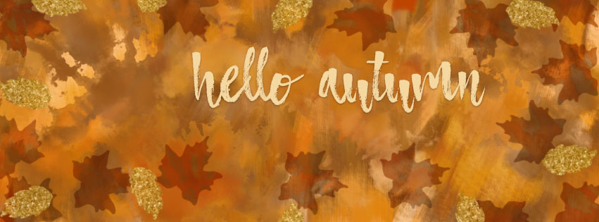
Hello Autumn

I had a lot of fun painting this image with brushes from the Creators Couture  Artistic Autumn Brush Collection.  To ensure consistency  with the fall theme, I also used one of the lovely color palettes that come with the collection. The gold effects were done with a gold layer style from the 24K Gold collection. The gold really adds texture and sparkle to the composition! The typeface is Atmosphere.

Happy Creating!

Disclosure: I will receive a commission for sales resulting from the above product links. I only share links to products that I own, use, and sincerely recommend.

Ready to Blog Again

After a fairly long absence from attending this website, I’m back and ready to blog again. Much has happened while I’ve been “away” (Covid-19, loss of job, life in general). Rest assured that I wasn’t idle when it comes to pursuing my passion for art, design, and photography during my absence!

Moving forward I will share some of the things that learned, and some of artwork that I worked on.

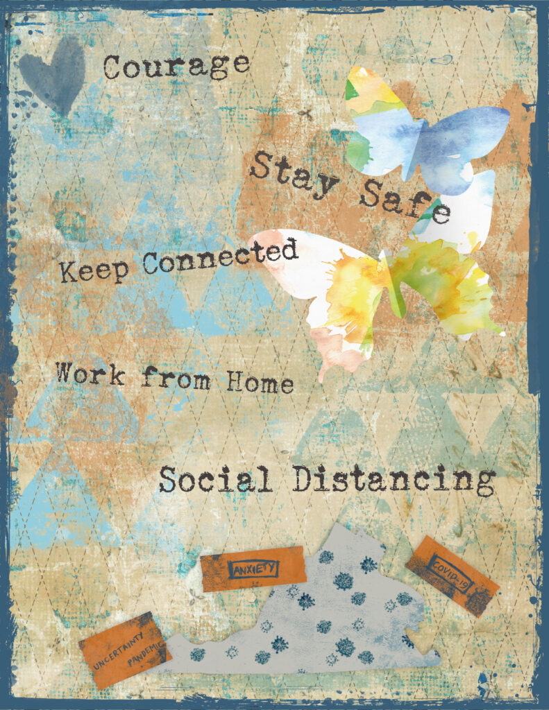
I’ll start with a digital art journal page that I created during the Covid shutdown in early 2020.

Art Journal – Covid page

For this page I used various resources from Tangie Baxter & Co. (background, edge) and DigitalScrapBook.com (stamps, washi tape, map, other elements). The font is Sears Tower. It was helpful to engage in some relevant art therapy at the time.

Adding Texture to Photography

Credit: Chris Barbalis (Unsplash)

It’s hard to believe that it’s been so long since I last posted, but I’m back with this post about adding texture to photographs. The idea of adding texture to photographs has been an interest of mine for years. Over time I’ve taken several online classes both on how to make and on how to apply textures.

One of these classes was offered by Kim Klassen and I thoroughly enjoyed the class! Kim is a very talented photographer and artist. Happily, Kim is back with Texture Tuesday 2.0 this week. In her post she introduces a set of lovely mono grunge textures, and also a set of light and shadow overlays for download. In addition, she shares three videos with instructions on how to use the textures and the overlays. I urge everyone who is interested in textures to visit her website and download these assets!

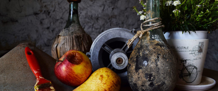
Of course I wanted to experiment and play with the new textures. I opened up a still life photo from Unsplash to work with in Adobe Photoshop Creative Cloud. The process that I followed is described below.

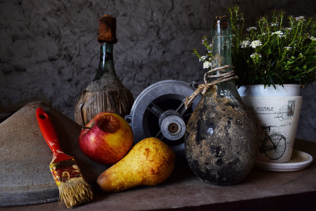
Here is the unedited photo:

Credit: Chris Barbalis (Unsplash)

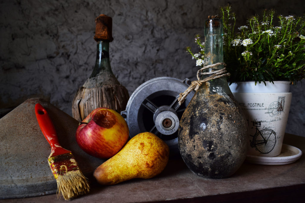
As you can see, the image is rather dark but shows a fair amount of texture already. I decided to apply the 5.together texture from the collection and set the blend mode to Overlay. Also I lowered the opacity of the layer to 85%. Then I added a layer mask and painted over the white flower pot (on the right) so that it wasn’t too bright and distracting.

Photo with added texture

The effects of the applied texture are subtle, but the result is to brighten the objects in the photo and to bring out and enhance the various textures in the image.

It was a lot of fun to do and I look forward to playing more with the other textures!

New Tote Bags

Not long ago VIDA added tote bags to their product line. I’d been wanting to upload some of my designs to be featured on totes for a while and finally got around to it!

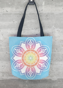
The first one (below) is a variation on a mandala that I created in Photoshop CC. I described the project in this post on my blog. For this variation I applied a different gradient and texture.

Textured Mandala Tote

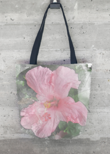
The second one (below) is a reuse of my first design for VIDA, an applied watercolor effect to a photo of a hibiscus flower that I took at Walt Disney World a couple of years ago. I continue to love the watercolor texture effect as applied to photographs!

Pink Hibiscus Tote
Pink Hibiscus Tote

Arts Classes Galore

Sorry to say that I’ve been absent here on my blog for the past couple of months. Following the completion of the Mandala Magic workshop (see previous posts), and also a busy holiday season, I found myself signing up for a Premium membership on Skillshare.com (referral link at the end of this post). Suffice it to say that I went a little wild taking a bunch of different design related courses! I’m very glad that I did, and I’ve learned a great deal.

For each class that you take on Skillshare you are invited to complete a project to demonstrate the new skills that you’ve learned as a result of taking the class. I’d like to share some of my projects here. There are more in process and I will add them to this post later on. Continue reading

Wearable Art

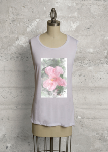
Vida: Hibiscus Bloom

I am so pleased to announce that I have become a VIDA designer! They found my artwork online and contacted me to inquire if I would be interested in collaborating with them. VIDA is a Google Ventures company which connects designers with apparel makers all over the world. Read more about VIDA and their story here.

As I’ve mentioned elsewhere on the blog, this has been a time in my life when I have been cultivating my interest in creating visual art in various forms – from photography to digital art to drawing. Of course the idea of having my art incorporated into apparel and accessories is very exciting!

Yesterday VIDA accepted my first design and launched my collection. It is called Hibiscus Bloom, and it is based on one of my photos from Florida last year. The design is featured on a white Sleeveless Knit Top. I love adding texture to photographs, and in this one I used a technique with Photoshop brushes to create a watercolor effect.

Here is a link to my collection page at VIDA.

Please take a look!

Sketch and Watercolor Effect on a Photo

Not long ago I was looking at some of my favorite artistic sites for inspiration. I came across examples of  a technique which creates an effect on a photograph that makes it look like it is partly a drawing (or illustration or sketch). This technique seems to be popular for use in digital scrapbook and art journal layouts, however it could also be used for other purposes like creating lovely fine art prints to hang on your wall. While colorful travel photos work great with this technique, portraits or other types of photos could be used as well.

Continue reading

Textured Vintage Image

I love to collect vintage images for use in my digital artwork. Today I want to show you this pretty vintage teacup image (get it here from the Graphics Fairy) which I modified by adding a texture and other embellishments (resource links below).

The original vintage image has a white background which seemed too plain. So I decided to add a texture. In this case I chose a free texture by Kim Klassen. Visit her blog here to view her lovely textures, both free and paid. You can sign up for her email list and receive updates, information about classes, tutorials, and more.

Continue reading