My Favorite Tools for Making Mandalas

Today’s topic is a look at some of my favorite tools for making mandalas.

First, let’s look at drawing a circular container. It is often okay to draw around a circular object or draw it freehand. However, a perfectly uniform circle of a specific size is necessary to construct a geometry mandala. For this purpose compasses are the best tool. My favorite is the Staedtler Comfort 6″ Compass Set. I use mine frequently! It’s easy to use and works like a charm. The set also contains extra leads, another needle, and an adapter. The adapter is handy when using a marker instead of a standard pencil to outline the mandala.

Another helpful tool that I like is the Helix Angle and Circle Maker. It is a Protractor and Compass in One. In addition it features smaller circle templates within it. I especially find the 360-degree marks are useful in evenly marking off grids.

Lastly, I recommend having a t-square in your mandala-making tool kit. This economical 12-inch Helix Plastic T-Square is very useful to ensure 90-degree angles when constructing a mandala. It is also useful for cutting down paper into smaller sizes.

I hope that these recommendations are helpful to you in your mandala-making endeavors! Please let me know in  the comments how these tools work out for you, or if you have other suggestions.

As an Amazon Associate I earn from qualifying purchases.

Participation in Circles Cycles Symbols Event

Originally my plan was to blog about my daily experiences in the Circles Cycles Symbols event as noted in my previous post. However, due to some different issues, I was not able to follow through as planned. On the bright side, I completed all of the exercises by the last day of the event (today).
Rather than making separate posts for each exercise I will summarize them below. Here goes!

Exercise 1 – Circles
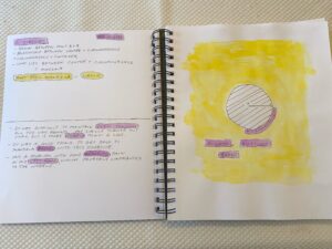
Basic circle geometry
 
Back to basics with Circle Geometry. This was a good refresher. The photo above is from my art journal entry and shows my efforts with this exercise. I like how adding splashes of color to highlight information made this simple exercise more artistic.
 
Exercise 2 – Concentric Rings
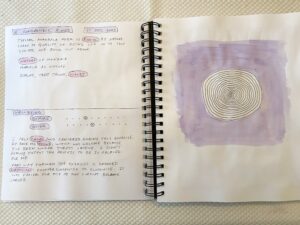
Concentric Rings
Concentric Rings
 
The exercise was to draw concentric rings starting at the center and radiating outwards. It helps with focus and is calming.
 
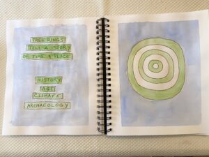
Concentric rings with descriptive words

The prompt was to create a two page spread of concentric circles with matching descriptive words. I thought about tree rings, and how using tree ring dating can tell the history of a particular time and place.

 
Exercise 3 – Connections
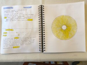
Connections with radial lines

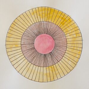
A basic mandala grid can be formed by connecting the center and the circumference with radial lines.

 
Radial lines and concentric circles

Sections can be made large and small. The rays suggest the sun.

 
Exercise 4 – Combination Grid Mandala
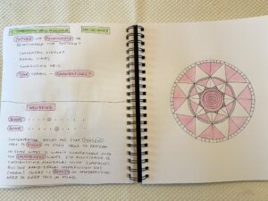
Combination Grid
Combination Grid

Combining concentric circles, radial lines, and connections creates a more complicated and interesting mandala. Adding color can also create patterns. There are endless possibilities for different combinations with this star symbol mandala.

 
Exercise 5 – Two page spread
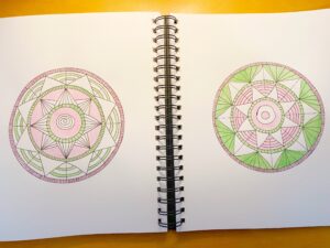
Twin Mandalas Spread

The final exercise was to draw  twin star symbol mandalas on facing pages. They are both variations on the same combination grid mandala from exercise 4. Notice how variations in lines, shapes, and colors can create different looking results!

The most important takeaways for me are:
  • Be present, and stay focused.
  • Don’t forget to breathe.
  • Let go of  worries about not being perfect. There is beauty in imperfection.
  • Stay true to your self and to your aesthetic.
  • Don’t be afraid to experiment.

This was a valuable learning experience for me, and I hope that anyone else who participated in the event found it rewarding! I highly recommend Mandala Magic School to anyone interested in learning more about the mandala art form. And definitely take advantage of any FREE workshops offered in the future.


Mandala Magic Taster Event

Have you ever wanted to learn the basics of mandala-making, or to find out about the symbolism and history of the mandala? Here’s your chance!

Circles Cycles Symbols
Circles Cycles Symbols Mandala Course

Right now there is a FREE taster event being offered at the Mandala Magic School. It will run from December 5 – December 15, 2023. To learn more and to sign up follow this link.

Currently I am participating in the event. My plan is to blog about my progress. Unfortunately I got a bit of a late start last night, but hope to catch up. At any rate, all of the lessons will be available for the entire length of the event.

Kiss With Fescu Tangle

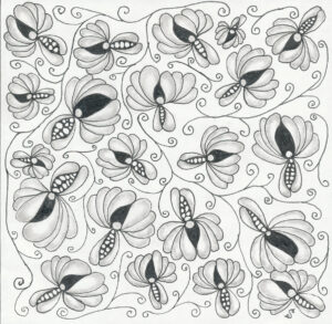
Organic and botanical tangles are a lot of fun to draw. One day I stumbled upon Kiss (by Olga Barko) in a YouTube video by Melinda Barlow, CZT. While I looked for step-outs, I was unable to find them illustrated on a sheet anywhere. However, the linked video demonstrates the steps for drawing Kiss.

As you can see below, I drew Kiss tangles every-which-way to cover the square. Then I added strands of Fescu to fill in the gaps and to tie the piece together. Lastly I added shading. In this case I used a larger square sheet by Strathmore (if I recall correctly), not a standard Fabriano tile.

Kiss and Fescu Tangle

Quick and Easy Autumn FB Cover

With Autumn upon us, I will show you this Facebook cover that I made using Photoshop color blending brushes and color palettes from Creators Couture. These brushes are so cool and easy to use, and they produce beautiful results! For this particular project, I followed a YouTube tutorial. I used the same assets for the most part, but repurposed the project to make a Facebook cover instead of the square background (second example) depicted in the video.

Hello Autumn

I had a lot of fun painting this image with brushes from the Creators Couture  Artistic Autumn Brush Collection.  To ensure consistency  with the fall theme, I also used one of the lovely color palettes that come with the collection. The gold effects were done with a gold layer style from the 24K Gold collection. The gold really adds texture and sparkle to the composition! The typeface is Atmosphere.

Happy Creating!

Disclosure: I will receive a commission for sales resulting from the above product links. I only share links to products that I own, use, and sincerely recommend.

Ready to Blog Again

After a fairly long absence from attending this website, I’m back and ready to blog again. Much has happened while I’ve been “away” (Covid-19, loss of job, life in general). Rest assured that I wasn’t idle when it comes to pursuing my passion for art, design, and photography during my absence!

Moving forward I will share some of the things that learned, and some of artwork that I worked on.

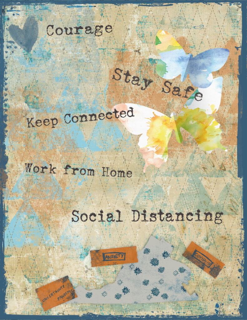
I’ll start with a digital art journal page that I created during the Covid shutdown in early 2020.

Art Journal – Covid page

For this page I used various resources from Tangie Baxter & Co. (background, edge) and DigitalScrapBook.com (stamps, washi tape, map, other elements). The font is Sears Tower. It was helpful to engage in some relevant art therapy at the time.

Adding Texture to Photography

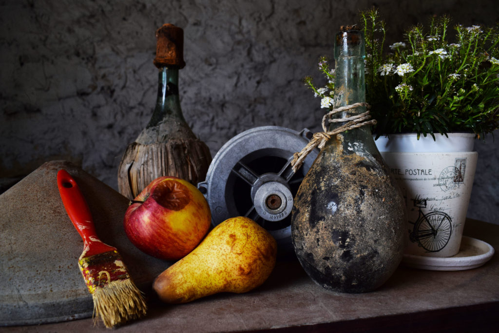
Credit: Chris Barbalis (Unsplash)

It’s hard to believe that it’s been so long since I last posted, but I’m back with this post about adding texture to photographs. The idea of adding texture to photographs has been an interest of mine for years. Over time I’ve taken several online classes both on how to make and on how to apply textures.

One of these classes was offered by Kim Klassen and I thoroughly enjoyed the class! Kim is a very talented photographer and artist. Happily, Kim is back with Texture Tuesday 2.0 this week. In her post she introduces a set of lovely mono grunge textures, and also a set of light and shadow overlays for download. In addition, she shares three videos with instructions on how to use the textures and the overlays. I urge everyone who is interested in textures to visit her website and download these assets!

Of course I wanted to experiment and play with the new textures. I opened up a still life photo from Unsplash to work with in Adobe Photoshop Creative Cloud. The process that I followed is described below.

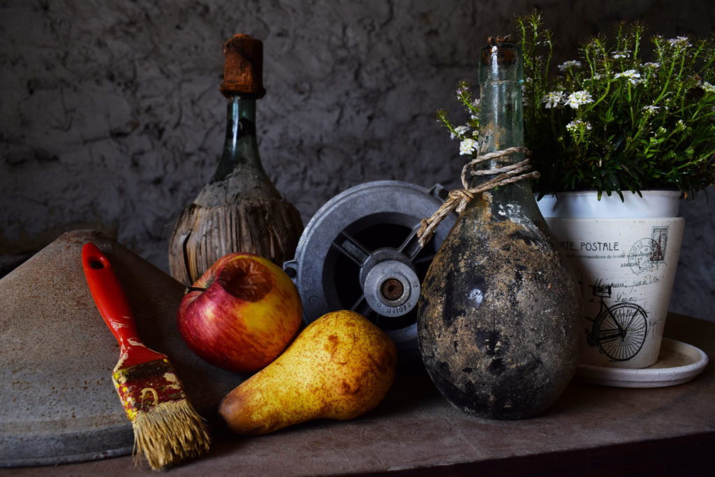
Here is the unedited photo:

Credit: Chris Barbalis (Unsplash)

As you can see, the image is rather dark but shows a fair amount of texture already. I decided to apply the 5.together texture from the collection and set the blend mode to Overlay. Also I lowered the opacity of the layer to 85%. Then I added a layer mask and painted over the white flower pot (on the right) so that it wasn’t too bright and distracting.

Photo with added texture

The effects of the applied texture are subtle, but the result is to brighten the objects in the photo and to bring out and enhance the various textures in the image.

It was a lot of fun to do and I look forward to playing more with the other textures!

Inktober 2019 Diva Dance Rock ‘n Roll

Diva Dance
Inktober Diva Dance

Due to a very busy schedule over the past several months I hadn’t been tangling as much as I would like .  Fortunately I became aware that Inktober 2019 is in full swing so I wanted to take part!

This Inktober tile features Diva Dance Rock ‘n Roll. The official step outs for all three versions of Diva Dance can be found here. In this instance I followed the simplified steps posted by Stephanie Jennifer on her blog, Everything Is Art. While I can draw it the original way I like flow created by the simplified method.

Valentangles

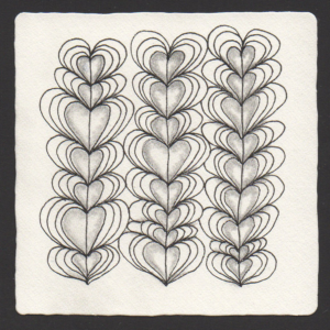
Heartswell

It’s difficult to believe that it’s been so long since I last posted. Suffice it to say that life has been hectic for me recently. Back in September I rejoined the labor force (after being a stay-at-home mom for a good while). I got a part-time job as an Administrative Assistant at a childcare center, and I am really enjoying it. In addition, I am also going to be an assistant art teacher with a local art studio. So happy!

So, back to posting about my latest artistic endeavors. A good place to start is with tangling. This week the Diva’s challenge is to create a Valentangle. I’m a little late, but I have four valentangles (all monotangles) to share.

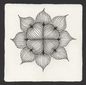
The first one features Heartswell by Helen Williams of A Little Lime. The step-outs are here. This tile was created as a gift for a coworker.

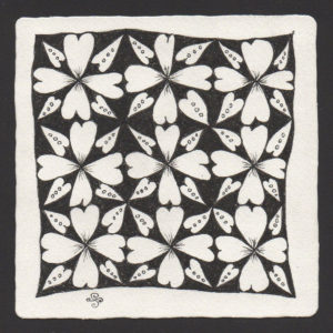
The second one is Cross-Ur-Heart, deconstructed by Jenna Black. You can find the step-outs here.  This radial pattern can also be thought of as a zendala. I like the feeling of depth which results from the shading and the radiating lines. This tile was also made as a gift.

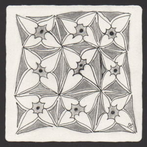
The third tile is a Heartsmeet monotangle. This heart-y grid pattern is by Lynn Hensley, and the step-outs are available here. Let’s just say that I was on a heart-themed tangling roll which continued on with the fourth tile.

And lastly I did another “hearts-in-a-grid tangle” featuring Heartfully, also by Helen Williams.

Hope everyone had a lovely Valentine’s Day!

Thank you for visiting.

Watercolor Coffee Illustrations

Here was a wonderful opportunity to combine various things that I love: Watercolors, Coffee, and Croissants!

My mother often spoke to me and my sister about how she started drinking hot coffee at age six. She grew up in Georgia. Call it fate, kismet, or whatever you like, but she introduced me to the enticing taste of coffee at a pretty early age. In my case, it was “coffee milk” (cooled coffee with milk and sugar), and also coffee ice cream. Any way you look at it the dye was cast. To this day I absolutely adore my coffee.

Given my coffee enthusiasm – plus my love of visual art – it was only a matter of time before I would want to find ways of combining these two things. And, of course, watercolor seemed a great medium to pursue!

As luck would have it I found two relevant classes offered at Skillshare:

Fun and Easy Watercolors: Draw a Beautiful Coffee Illustration by
Mariya Popandopulo

Fun and Easy Watercolors: Drawing Cookies and Pastry by
Mariya Popandopulo

These classes were very helpful and quite enjoyable, and I recommend them both. But I should point out that there is no shortage of other great classes and tutorials available out there on how to paint with watercolors. Check out other classes and video tutorials at Skillshare.com, Lynda.com, YouTube, etc.

MATERIALS USED:

PAPER

Canson Watercolor Cold Press Paper (140 lb, 11 x 15″ )

WATERCOLOR PAINTS (a variety of Browns, Reds, and Yellows)

Winsor & Newton Cotman Watercolors:
Raw Sienna
Cadmium Orange
Burnt Sienna
Burnt Umber

Pentel Watercolors:
Ultramarine
Yellow Ochre

Reeves Watercolors:
Deep Yellow
Red Ochre

INK

Sakura Pigma Micron Pen (01) in Black (for the bubbles)

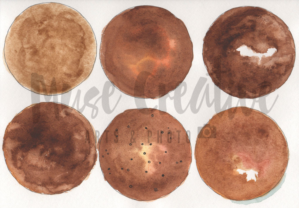
A practice exercise in the first class involved exploring different watercolor techniques to illustrate different looks for coffee. The image below shows my results:

Coffee Illustrations Using 6 Watercolor Techniques
Coffee Illustrations Using 6 Different Watercolor Techniques

The techniques which were used in the exploration excercise included variations on wet on wet, wet on dry, single color, and incorporating multiple colors. The bubbles were done in black pigma micron ink. The shading was achieved by using mixing colors to create a blue-gray.

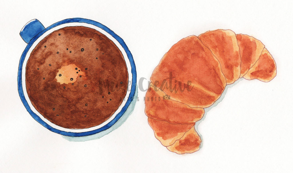
In addition to painting likenesses of cups of coffee, I also practiced painting croissants. Fortunately these pastries are fairly easy to draw, and the coloring was achieved by glazing different colors over one another.

Here is my final result.

Watercolor Coffee and Croissant

All in all I am very happy with how my painting turned out. Looking forward to creating other similar works in the future!

Artwork, photos, and graphics

© 2015-2022 Muse Creative Arts | Theme by NUDGE MEDIA DESIGN.