Back in March I realized there were classes that I still wanted to explore on Skillshare. Between taking a bunch of those classes and then things getting very busy in real life, I found that I didn’t have enough time to post here on the blog. So I’m back now and want to share a couple of projects and talk about what I learned.
WATERCOLOR BRANDING: CREATE YOUR OWN CUSTOM WATERCOLOR LOGO
Branding these days is more important than ever on the web, social media, etc. In this class taught by Teela Cunningham we learned how to brainstorm a brand. Next we went through the steps for combining a watercolor texture with typography and a vector design element to make a custom logo to go with our brand. Also discussed was how to make a watercolor texture and cut it out for use in a logo or in other graphics projects.
Project:
Create a custom watercolor logo in Illustrator or Photoshop using the steps described in the class. For my project I invented a fictitious tea house called “Bergamot Dreams”. Bergamot is an ingredient in Earl Grey tea (one of my favorites) and is also a wonderfully fragrant essential oil, so I thought it was a fun choice for a brand name.
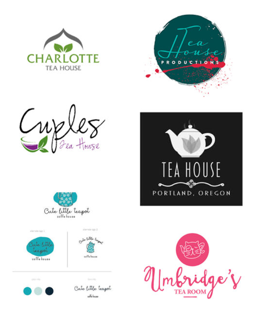
To find some inspiration, and to get an idea of what existing logos for the tea house niche look like, I did a Google search. Some of the tea house logos that I found appear below.
Regarding typography, I knew that I wanted to use a brush script font if possible. Brush fonts are very popular and since I already had a few in my font collection I really wanted to use one! After experimenting with different font pairings I chose Greatesque for the brand name and League Gothic for the descriptor. In addition I chose a leaf vector to give the logo a nice artistic touch.
Once the base logo was established I incorporated it onto two different watercolor textures (see below) and knocked out the font color to white to make it stand out better. I also experimented with masking the watercolor textures into the text for different looks.
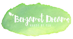

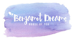

I’m not sure which I like the best, but I’m leaning towards the green texture masked into the text. It seems the most natural, organic choice since bergamot is green and so are many teas.
SOURCE & MIX BOTANICAL ILLUSTRATIONS WITH TYPOGRAPHY TO CREATE TRENDY DESIGNS
Given my love of vintage images this course, taught by Evgeniya Righini-Brand, was a natural one to tackle. The idea of combining old botanical illustrations with modern typography is very appealing. The process involves picking out an image, cutting it out from it’s background in Photoshop, and then overlapping parts of the image with the typography to create some depth and interest. The resulting designs are lovely and can be used in a wide variety of ways, including greeting cards, tote bags, t-shirts, invitations, art prints, etc. It’s a great way to update an old illustration by giving it a more modern touch!
Project:
Create a standard size greeting card featuring a botanical image and mix it with typography using the steps discussed in the class. I started with this vintage coffee plant picture from The Graphics Fairy…
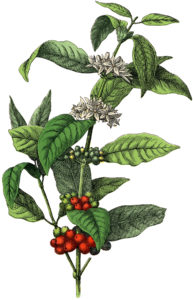
Fortunately the image is on a white background so the magic wand tool in Photoshop CC did a good job of selecting the background. Next I cut out various sections of the image, including one group of the white flowers, some leaves, and the red berries.
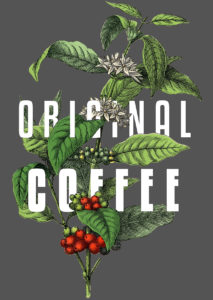
The font that I chose is Kenyan Coffee, a popular (and free) sans serif font. Given that the picture is of a coffee plant I thought that this font was just right. I went with white font because it is commonly used for this type of design. It does look elegant.
I had some difficulty in deciding what background color to use in my project. After experimenting with some colors that I eye-droppered from the image I settled on a dark grey color for contrast. My next issue was that flowers in the illustration are near white, which of course was the color of my font and they sort of ran together. After playing around for a bit I decided to add a small black stroke to the font to make it stand out.
The basic image that I ended up with is shown below. I really like how the leaves appear to weave through the font, and how the white font stands out against the grey background.
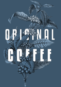
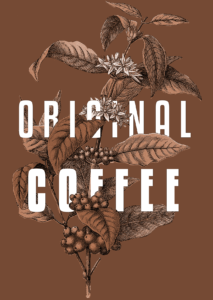
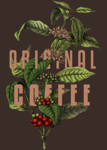
In class the use of adding artboards was introduced for the purpose of playing around with color variants. As you can see below, I tried colorizing two of them with hue/saturation adjustment layers (the blue one and the “chocolate brown” one below). Note that the font remains white. In the remaining image I applied a gradient map which darkened the overall image and changed the font color to a light brown.
